Ruffian manicures have been pretty popular lately, so here's my take.
My favorite colors are lime green and purple, so that's what I tried to work with. I used purple as the base, then lime green for the top. Wasn't the best idea, but I still really liked how it turned out.
For the base I used Lang Lang by Sinful Colors and on top I used Wild Thing by Pure Ice, my go-to (and only) lime green. (You can see some of Excuse Me by Pure Ice, and I'll explain that in a second.)
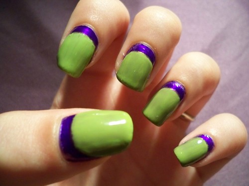
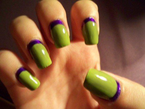
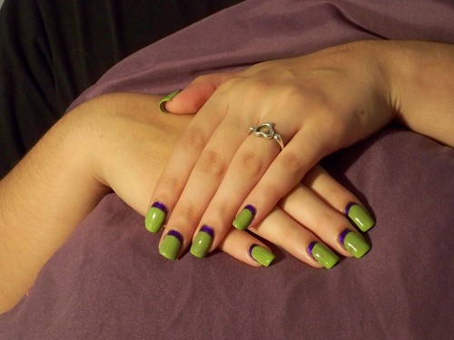
I learned a very valuable Ruffian lesson: the darker color just needs to go on top. I kinda knew that, but I really wanted the green to show more, so I broke the rule anyway...and regretted it. This is two coats of Lang Lang, followed by two coats of Pure Ice, then I topped it with to thin coats of Pure Ice's Excuse Me, a sheer yellow shimmer, to make it look lighter, but it ended up looking yellow instead of green, so I put two more coats of Wild Thing on top of that....along with various coats of topcoat along the way when I THOUGHT I was done. Whew.
So if you can pick out yellow shimmer, it's Pure Ice's Excuse Me that I ultimately covered up. That's also why it looks like there are 10 coats on my nails...cause there are. The green was piled on so thick, and it still ended up dulling and turning a murky green color on top of the purple.
I still like how this turned out. Making a neat rounded shape at the bottom was harder than I thought it was going to be though. I got quite a few compliments during the three days I wore this.
I'll definitely be trying this style again in different colors (and keeping the darker color on top!). Have you ever tried a Ruffian manicure?
Janna
I like it, and it is definitely true about the darker color on top, but you are never sure enough, before trying it =)
ReplyDeleteThanks =] Definitely learned my lesson on that one!
ReplyDeletePretty funky! Next time you should try it with the purple on top!
ReplyDeleteI actually love this combination! Yah, it's thick, but at a distance, like in your last pic, it looks awesome.
ReplyDeleteIt's weird, but where the two colors meet, my eyes for some reason are adding a thin line of gold... Okay, I need my eyes checked.
Tasha - Thank you! I'm definitely going to =]
ReplyDeleteABOP - Thanks so much. I love these colors together. That thin line of gold you're talking about might be the yellow I used to try and make the green lighter, but it failed. It still peaked through though =] You're not crazy! lol